3 clever ways how you can improve your fund management website, so that you’re not throwing away new client signups
Fund management firms, compared with other firms have often been behind the curve in terms of adopting digital marketing strategies. If you have your hands full with compliance, security and regulations, it is rather understandable. However, to retain current clients and win new ones, fund management firms looking to differentiate must adapt quickly to the new disruptions in the industry.
With clients gravitating toward digital, your website needs to offer a more personalized and user-friendly experience than the competitor’s one. It is therefore important that you take sufficient time to design and optimize your website.
Because we all know that capturing the attention of your audience has little value if you can’t capture their contact information...
Here are 3 ways you can improve your website, so that you’re not throwing away new client signups:
1. Call-to-Action buttons (CTA)
Improve the UX (User Experience) by adding descriptive CTAs. Descriptive CTAs let your viewers know exactly what they'll be clicking into. Make sure to display CTAs logically, in easily seen places such as in the header, sidebar as well as the middle of the homepage.
“Floating” Contact Us Button - The button will float along while your visitors scroll down the page. So whenever they have something to say, there’s no need to look for a way to contact you – it will always stay visible. When clicked, the button opens a form allowing visitors to leave their message.
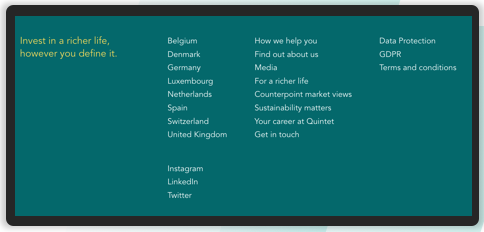
Footer CTAs - Footer CTA provides a 'cap' to your content, and the perfect opportunity to offer key information to your visitors. A simple, but thoughtfully laidout footer section can indicate what to do next. Footer CTAs can include:
- Contact, address and business hours
- Social media buttons
- Other websites/ branches
- Careers & Vacancies
- Copyright, T&Cs, GDPR & Data Protection
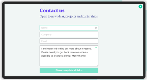
2. Contact Us Form
Include a short form using fields that'll help the business understand who's contacting them. Fields can be combined or available as options. Keep the design simple & clean.
Our tip: Use auto-populated fields to save visitor’s time or provide a Drop down menu asking how they can help you on this unique contact us page.
3. Personalisation
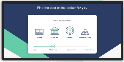
You can improve UX drastically by personalising your website. Companies like Betterment use a short questionnaire on their frontpage with principles- based technologies such as computer algorithms. Based on the outcome, the user gets directly to a licensed advisor based on their needs. BrokerNotes for example, helps investors choose the best brokerage firm. Their website uses a multi-step form to ask users relevant questions and refines the list of recommendations to suit their answers.