

Line charts range from simplistic, static charts depicting related variables to complex, customisable interactive charts
Key points
- The line chart is probably the most used chart in finance
- It illustrates movement in the price and returns of an index, security, fund or portfolio
- It can also communicate a “story” through trends and spikes
- There are many ways to evolve and improve on this simple but effective visualisation
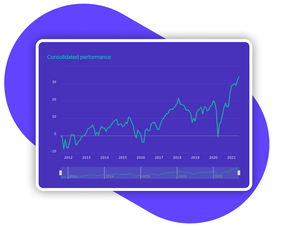
The line graph is used everywhere you look
You’ll be familiar with the line chart; a line of connected data points tracking changes in related variables - like tides and hours of the day or, in investment, an asset’s variations in closing price over intervals of time (time is the variable most often used in line graphs). Variables are always marked along an X-axis (horizontal) and Y-axis (vertical).
The line graph has been in use as far back as the 10th or 11th century, and today it is ubiquitous in finance, where it is used to track the performance of equities and mutual funds as well as discretionary portfolios.
Telling a story through trends and spikes
An investment-focused line graph can illustrate two variables against the same timeline, for example total return Vs price return. It can be used to compare the performance of multiple funds over time, or to show how an investor’s fortunes would have unfolded, depending on the year in which their investment portfolio was opened (“year zero”).
Adding context with real-world events
A line graph can be used not just to track variables in diverse ways, but to provide an understanding of the real-world context impacting them. For example, a “crash drawdown” graph can show the impact of various regional or global crises on a fund in recent times, thereby telling a “story” about the fund’s relation to the wider world.
This attribute makes line graphs useful not just for understanding the past but to inform predictions for the future, based on past patterns. Institutional investors closely study portfolio returns, stock price or other variables over the course of many years, to guide their next investment choices.
The signature of an investment
At its heart, the line chart is the “signature” of an investment, telling its story over time. Some firms choose to evolve it into a more complex form that visitors don’t just view but manipulate. In some line graphs, you can adjust the timeline and other settings to view portfolios from different perspectives. In a wealth portal, you can plot contributions to focus on growth achieved. Sometimes, simplicity is the way to go: no grids, no added lines. The shape and movement tell the story.
At Invessed we consider and optimize the user experience, from the ubiquitous yet effective static line graph to interactive visual data. Start a conversation with us and we’ll help you tell a compelling and engaging story to your institutional investors.